Headstrong
This case study delves into the design of Headstrong, an app that explores a new way to leverage teenager’s phones to support their mental wellbeing. The project, brought to us by New Zealands largest University, the University of Auckland (UOA), explored using AI driven chatbots to give teenagers a safe space to talk about anything that is troubling them.
Project
Headstrong
Year
2022-2023
Duration
12 weeks
Client
University of Auckland
Team
Designer + Product Owner
Sector
Health and Wellbeing
In a nutshell
-
The University of Auckland's Faculty of Medical and Health Sciences engaged RUSH to explore new ways to leverage teenager’s mobile phone time to support their mental wellbeing. They first engaged us in 2018 to support in creating a proof of concept to take to clinical trials, and when that was successful and they received further funding from The Ministry of Health, we were approached again to take that proof of concept and turn it into a beautiful, well-considered, and empathic digital experience for teenagers.
-
As the primary designer, my role encompassed the entire UX and UI process of creating the Headstrong app. I was responsible for comprehensive user research, competitive benchmarking, UI and accessibility audits, prototyping, and user testing.
-
The University of Auckland's Faculty of Medical and Health Sciences engaged RUSH to explore new ways to leverage teenager’s mobile phone time to support their mental wellbeing. The result was a project initially called Aroha, the features of which were combined with COVID-19 wellbeing advice and launched in 2018 as a clinical trial.
The chatbot was released as a bot on Facebook messenger, where you could have a conversation with one of the avatars as if it were any other friend or family member. However, in 2021, Facebook changed it’s regulations which meant Facebook Messenger was no longer able to retain conversation history, which was integral to the purpose of having an ongoing conversation with the avatar. Because of this, in 2022, the UOA once again engaged RUSH to create a dedicated mobile app with a more considered experience. -
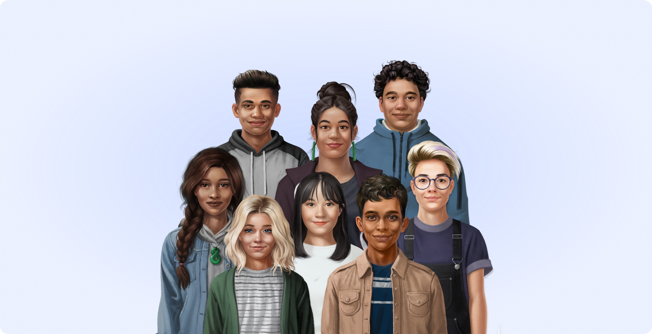
We worked on this project in collaboration with psychology experts, cognitive behavioural therapy experts and young people’s mental health experts. We created a group of teenage ‘personal trainers’, unique avatars that teenagers could talk with. Each was made to be as relatable as possible for young people in Aotearoa (New Zealand). Not super athletes or cool kids, just relatable friends that teenagers could feel comfortable with. One of these avatars was Aroha, who became the face of the project when it was adapted by the Auckland University clinical experts to address the mental stresses during the COVID-19 pandemic.
How it works: A chatbot simulates a conversation and allows people to interact with a digital guide as if they were communicating with a real person. The app was designed to make it easy and engaging for young people to learn techniques for supporting mental health and wellbeing via short interactions with the chatbot. Characters use stories, motivational whakatauki (proverbs), audio tracks, infographics, mini games and more to make the content more relatable.
UX Research
Step 1
Stakeholder Interviews
We began by interviewing five inspirational experts in the fields of psychology, cognitive behavioural therapy and young people’s mental health. We learned that talking therapies and Cognitive Behavioural Therapy (CBT) have proven successful in helping youth improve their mental wellbeing, and they need to be equipped with effective evidence-based tools they can use.
Step 2
UX Review
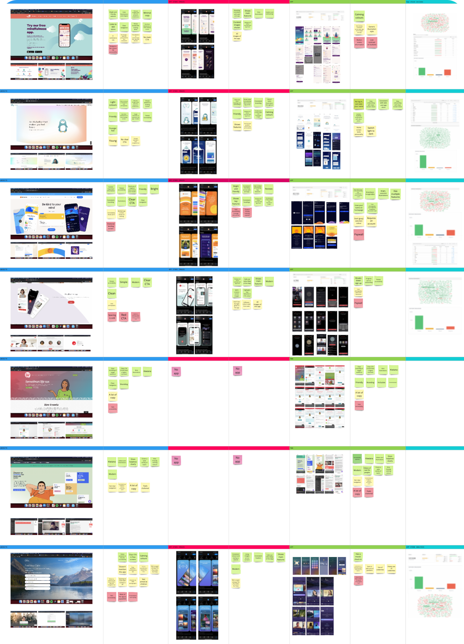
As I hadn’t worked on the proof of concept in 2018, I wanted to do a thorough UX review of the experience, to identify areas for us to improve, and understand if there was anything that was already working really well. I did an audit on both the marketing website and the messenger experience, focusing on 3 key areas; accessibility, user experience, and the interface design.
Step 3
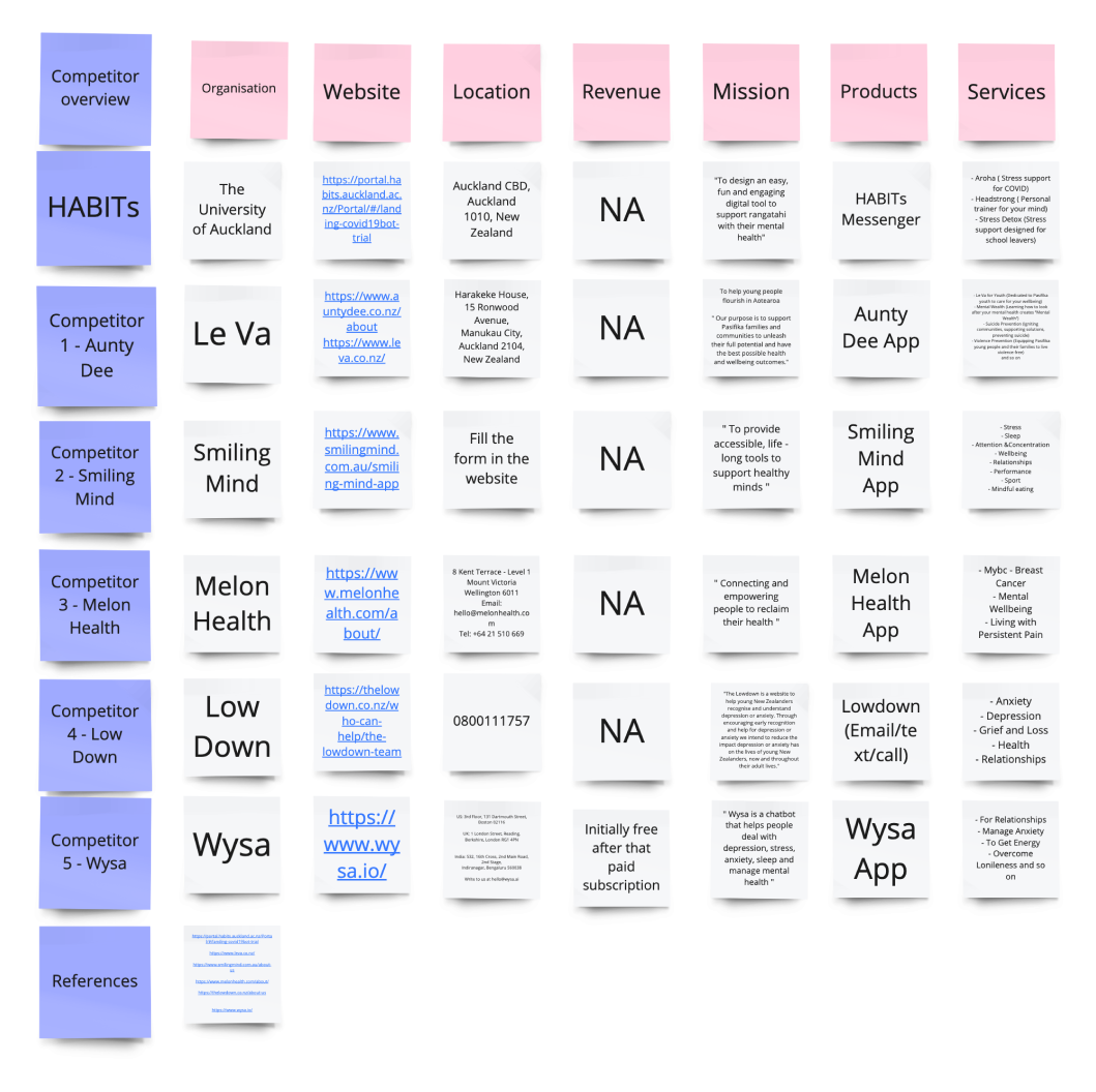
Competitor analysis and UX Benchmarking
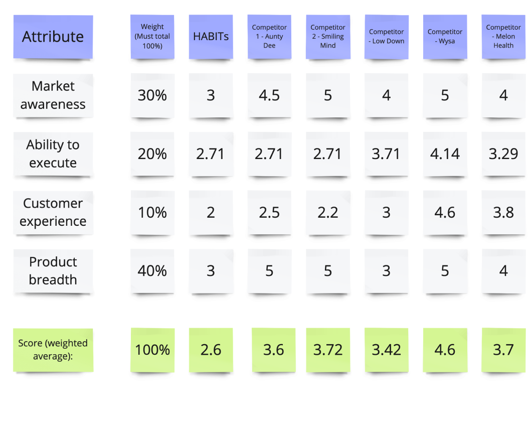
I wanted to get a really good idea of what other wellbeing platforms were doing, both in New Zealand and abroad. Headspace was a key reference in this project, as it was seen as a north star in terms of brand positioning, tone of voice, and overall success in its offering. I also found WYSA, a UK based business, also paved the way when it came to the user experience and breadth of product. It is a friendly, welcoming, and directed at a younger audience, which was pivotal in the design direction.
Step 4
Story mapping workshop
To get a good grasp on the considerations required for the app, as well as the data collection requirements, and overall journey map, we conducted a Story Mapping workshop.
We broke down into the 3 main jobs to be done (JTBD), which was that someone will want to come onto the app, and (1) try slowing down and taking care of themselves with the app, (2) choose a course to try to do this, and then (3) select the avatar they resonate with the most to speak with.
We did the exercise with the field experts, our client (UOA), and our core team from RUSH. We broke out into 3 groups, and each group took turns planning out the story map for each JTBD. We would spend time on this, and then rotate onto the next one. This way, we were able to get as much focus time on each, and be able to refine it down to be as accurate as possible.
The outcome was a single source of truth for the UX wireframes, and set us up for the Design Studio where we would be taking the same group through fun and engaging challenges based on HMWs we identified through the research to date.
UI Design
Step 1
Rapid low-fi prototyping
Post story mapping workshop, we gathered all the flows into a Miro board for synthesis. This allowed us to quickly develop low-fidelity prototypes which started out as drawings on paper, then was transitioned into low-fi wires in Figma. They were based on the mapping which set out the ux flows that would later set us up for the user testing and hi-fidelity designs.
Step 2
Test plan and moderated user testing
As far as user testing goes, this has to be the most unique experience I have had with it. Because of the demographic of the app, we had to recruit 13-21 year olds to test the app with, and as the UOA were doing the recruitment for us, we ended up with a wide range of ages, with the youngest being 12 years old.
I have done user testing for years, but this was truly unique, and probably the best interviews I’ve had the privilege of conducted. I was apprehensive at first as I hadn’t done testing with such young participants before, but I was so surprised when they ended up being the most honest, constructive, open, and invested participants I have ever interviewed. They were so willing to give feedback that was genuine, rather than pandering to what they thought I wanted to hear, and they were overall so excited to be a part of something that they saw genuine value in. I was blown away by all of their curiosity at such a young age, some of them left the session sharing with me that they wanted to have a future job in tech or design because they enjoyed it so much themselves.
Key outcomes from user testing
Privacy: Users wanted the chat experience to replicate other messenger apps they have so they could use the app without friends or family being nosey (i.e on the school bus)
Personalisation: All the users liked that the app asked for their name and age, and hoped it would come up on the landing screen once they finished onboarding
Pronouns and ethnicity: All users liked that you could put input this information, and assumed it would tailor the experience
Guide selection: Users wanted to select the guide who looked most like them (gender and ethnicity). One male participant wanted to select one of the female guides as she reminded him of someone he was friends with in primary school.
Chat screen: Most participants liked how the chat looked and could relate to how it worked because it’s similar to other chat apps they use.
“There was nothing confusing”
“I’d call this very useful”
“This is calming”
“It feels inclusive!”
“I would use this if I was feeling stressed”
“It’s relaxing and calming”
Step 3
Visual identity refinement
Embracing the challenge
At the outset, Headstrong lacked a strong visual identity since the project was initially created as a proof of concept for a clinical trial. This presented an opportunity for creative exploration, brand development, and redefining their market position. Previously, I had seen UI exploration and development as my Achilles' heel, so taking on the task of crafting a visual identity for a client was a daunting. Looking back, I am immensely proud of this project, particularly for its UI design. It's gratifying to note that this work has also gained widespread recognition, winning national awards such as the Purple Pin at the Best Awards, and international acclaim with two Gold awards at the Indigo Awards.
Research and exploration
I dedicated the initial 2-3 days exclusively to exploring UI possibilities. This involved in-depth research into existing wellbeing brands and digital experiences. Returning to the benchmarking work I had done earlier proved really valuable here, as Headspace and WYSA were both very visually stunning and calming apps. I researched brands popular among younger demographics. This led me to download and use social media sites like I was in the age demographic, so I could immerse myself in the marketing and content trends appealing to the 13-21 age group.
Design development
Simultaneously, I spent numerous hours in Figma, experimenting with shapes and colours. I explored into colour theory and clinical research on colour psychology to inform my design choices. This research was crucial in understanding the optimal approach for the UI.
I settled on a design that felt soothing and calming, incorporating only organic shapes and three primary colours: green, blue, and orange. These colours are known for their calming effects, aligning perfectly with my goals. The app predominantly featured pastel green, introducing other secondary colours in specific courses for variety.
Cultural sensitivity
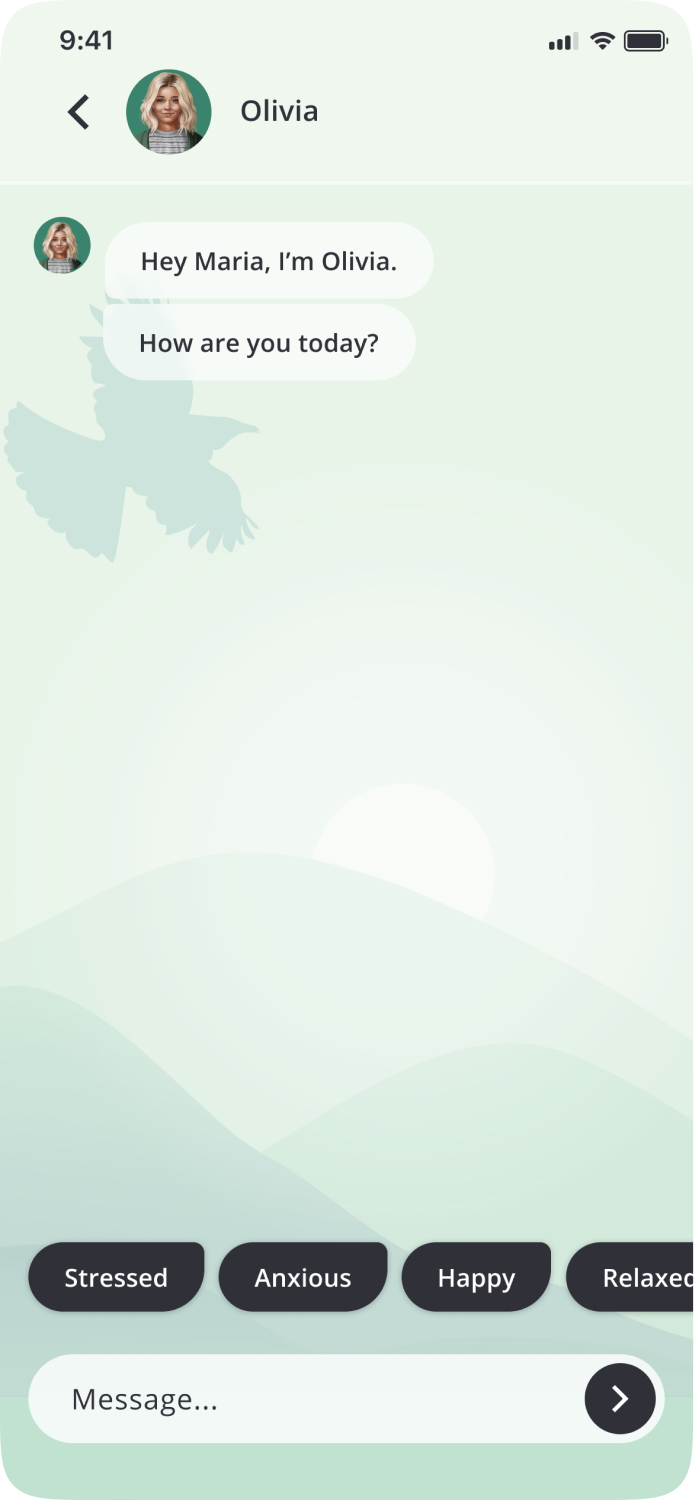
A key consideration was the app’s target audience, which included Māori and Pasifika teenagers. Aware of the cultural implications of colour and imagery, I collaborated with a cultural consultant. Their support was very appreciated when guiding me in cultural sensitivity, particularly in designing chat interface backgrounds for various courses.
The chat backgrounds needed to be subtle, aesthetically pleasing, and calming. Having a cultural consultant to navigate sensitive concepts was invaluable, especially as a New Zealander without direct ancestry from these cultures. As an example, we wanted to include New Zealand wildlife, however, there are some instances in Māori culture where some birds can have connotations with death. So their insights significantly helped me and shaped the project’s direction.
Step 4
High fidelity designs
After establishing the new visual identity, completing user testing, and finalizing the story map, I moved on to create the high-fidelity designs for the development team. This phase was particularly enjoyable, as I had already spent significant time exploring the visual brand, which gave me a strong foundation and confidence in designing the app's UI. The project turned out to be more enjoyable than I anticipated as I initially doubted my skills in UI design, but I'm really proud of the final outcome.
Dark Mode
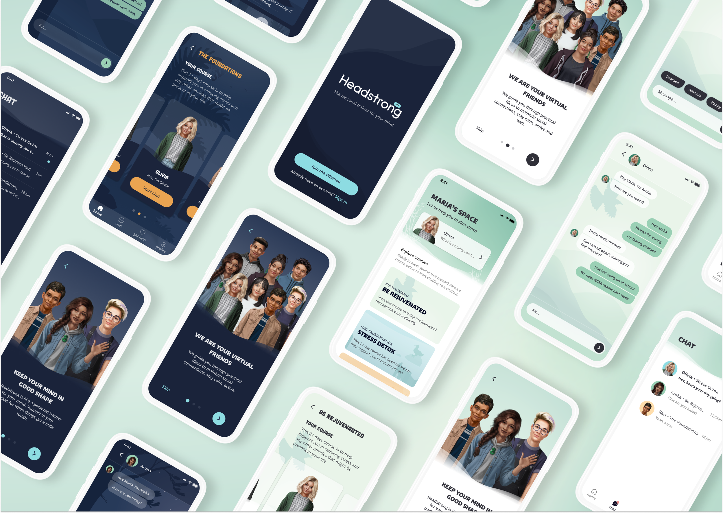
As part of the user testing, I discovered a really interesting insight from our younger audiences. It was that privacy was of high importance to them, often people don’t speak up about how they are feeling because they don’t want to turn to friends and family, for whatever reason. It also meant they didn’t want friends or family knowing that they were using Headstrong. If they were using it at night before going to bed, they didn’t want to get noticed, so dark mode would be highly valuable for them.
Dark mode is also becoming increasingly popular for many reasons, and we wanted to provide an experience that addressed some of the more important reasons. The first one being accessibility and inclusivity; dark mode is often more accessible for users with certain visual impairments or sensitivities to light. We also were aware that dark mode increased eye comfort and reduced strain, which is especially important when we want the overall experience of the app to be as calming and relaxing as possible.
Lastly, we were keen to include dark mode because of the general direction apps are taking, we were conscious throughout this process that the app was targeting a demographic that stays ahead of the curve, and spends a lot of time on their phone. We wanted to provide dark mode as an option as it aligned with current trends and is almost a given nowadays in digital experiences.
On the left are some examples of the comparison of dark mode and light mode, and when we tested this again, people really resonated with the dark mode.
Next steps + Learnings
Learnings
Once the full designs were complete and we had the website up and running, we did a final handover with the internal development team at UOA. We were having ongoing design conformance discussions with their development team, but as the project came to close, I ensured that the Figma was marked up, and design notes were left for the developers. Specifically so that they were supported in the implementation of accessibility requirements, and other feedback indicators, such as haptics and animations.
Next steps
Headstrong was a very unique project for me as I always viewed myself as someone who was very process driven, very Type A, where I liked things to be black and white, and why I thought I was always far stronger in UX than UI. When I was assigned to this project, I questioned with my design lead whether I was the right person for such a UI heavy project, and her belief in my abilities really helped me to open up to the idea that I could do it. She gave me space, and time to go about it the way I needed to, which was with research, and reason, but as I got into the flow of understanding the process of creating a visual identity, I really enjoyed this project.
Another thing that was truly unique about this project was the nuances of the demographic, both from a cultural and an age perspective. I was consistently amazed and impressed by the contributions from young people involved in the project. The curiosity, advocacy for their peers, and awareness of inclusivity and representation within the app was heartening. Their involvement was really important in ensuring that the app resonated with a diverse audience.


