Foodstuffs
In this case study, I delve into the development of a versatile design system for New World, New Zealand's premier supermarket under the Foodstuffs umbrella. This system, crafted with a token-based architecture, was designed for adaptability across Foodstuffs' diverse supermarket brands.
Project
Design System
Year
2023 - 2024
Duration
6 months
Client
Foodstuffs NZ
Team
1 Designer, 1 Product Lead, 2 Developers
Sector
Supermarket
In a nutshell
-
With New World gearing up for a major brand expansion, a robust design system became essential. The growth phase demanded a unified design framework to ensure brand consistency and streamline processes amidst an expanding team.
-
As the primary designer, my role was focused on shaping the design system. I did the hands-on design of components, led the creation of design tokens, and took the lead in developing full documentation and guidelines. Collaborating closely with the client, I facilitated workshops to establish core design principles and trained their design team for continued success.
-
Foodstuffs, New Zealands largest food retailer, has 6 brands under their umbrella, with New World and Pak’n’Save being two of the largest supermarkets in NZ. When Foodstuffs came to us, they were looking to create a design system that could essentially be a white label solution that could be implemented across the 6 brands. With a small internal design team, they were looking for support in direction, creation and execution of the design system. They were in need of a solution that would be scalable and very flexible, as they are moving into a large innovation piece of work in early 2024, and they were hoping to expand their design team.
-
Through extensive research, and some trial and error, we landed on a scalable solution that allowed us to create a full design system for Foodstuffs biggest brand 'New World, and allow their designers to duplicate the design system and make minor changes to cascade another of their brands across the design system. We did this by utilising tokens, which allowed design to be largely flexible, and to be able to push all decisions through to storybook through automation.
UX Research
Desk research
Contextual Immersion
Design Principles workshop facilitation
UI and Accessibility Audit
Design Principles workshop creation
Step 1
Desk research
Knowing up front we wanted to use tokens to control the design system, this is where I started my desk research. I studied several leading companies known for their advanced design systems, focusing on those utilising design tokens. This included major players like Atlassian, Salesforce, Google, Microsoft, Apple, IBM, and Uber. Atlassian's approach, for instance, was particularly insightful; their design tokens act as a single source of truth, simplifying design and development collaboration and ensuring visual consistency across their products. Companies like Amazon and Salesforce, pioneers in this field, have demonstrated how design tokens can effectively control the design process, save time, and ensure cross-platform compatibility by storing key style values of design elements.
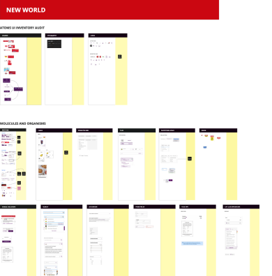
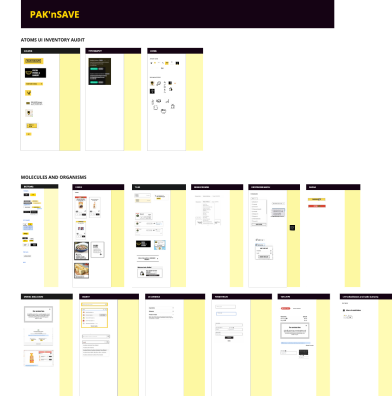
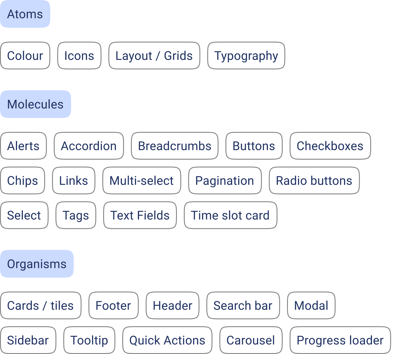
The decision to use the Atomic design system structure was influenced by its proven success in these leading companies. The Atomic design system’s modular approach, with its focus on building from atoms to more complex organisms, perfectly aligned with our goal of creating a scalable and adaptable design system for Foodstuffs. It offered an intuitive and systematic way to organise our design elements, making it easier to replicate across Foodstuffs' diverse brands and simplifying onboarding for new designers.
A crucial learning from this project was the importance of meticulously structuring the token tree. This structure was fundamental not just for immediate needs, but also for ensuring the system's adaptability across multiple brands and platforms, including webstores, apps, and in-store self-checkouts. Another significant insight was the balance between flexibility and simplicity; the design system had to be robust enough to scale across Foodstuffs' six brands, yet intuitive enough to empower the designers, making them feel comfortable and capable of using and growing it effectively without feeling overwhelmed.
Step 2
Design principles
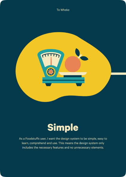
I began the project with a design principles workshop, an effective strategy I had developed during my time at RUSH. This three-hour workshop was instrumental in setting up the project for success, especially for a design system, as it provided the team with a set of guiding principles. By the end of it, we established five core design principles that became the project's driving force.


Step 3
Accessibility and UI Review
I conducted an accessibility and UI review of the client's existing platforms, focusing primarily on their webstore, which was the primary area of traffic and initial implementation. The goal was to ensure the design system was fully accessible from both design and implementation perspectives. My review culminated in a detailed report outlining findings and recommendations for enhancing their existing components, ensuring accessibility for all users.
Step 4
Contextual immersion
To gain deeper insights into the client's work culture and processes, I spent a few days in contextual immersion at their office. This experience allowed me to observe the designers' current workflows and ensure that my design decisions complemented their practices. This step was crucial in avoiding any disruption to their efficiency and also helped me build a strong relationship with their design team.
Key findings from UX Research
👉 Tokens are a better fit than variables (for now)
During the desk research phase, Figma Variables were released as a beta product. This threw a curve ball into the decision making process of the token tooling. We weighed the options, and found that for now, to not take any unwarranted risks, we wouldn’t base the design system on a beta tool. Variables also lacks the ability to do type and gradient tokens, which were required for this design system.
👉 The approach to tokens needs to be simple and empowering
When doing the contextual immersion, it was clear to me that we needed to make sure the designer felt they were brought along on the journey. There was apprehension from the team, and the decision to implement the design system was coming from above the on tools team. Once this was realised, our team made it our utmost priority to include their team where possible, and make sure all of our decisions were easy, and the structure empowered their team to learn and keep up to date with the evolving system.
👉 Accessibility of the current implementation is great, but UI needs consideration
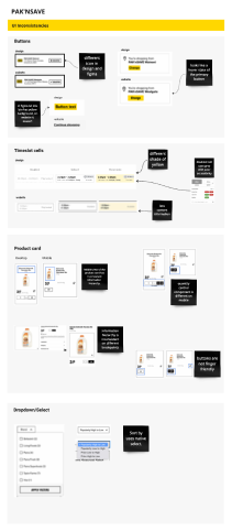
Foodstuffs already had high standards when it came to accessibility, and so there was little consideration needed in changing their existing UI or implementation of the (code and usage of components). The UI and UX itself (outside of accessibility) needed attention, as there were issues with consistency of components (18 different CTA styles), and there were patterns that were confusing to users.

UI Design
Step 1
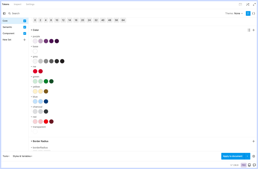
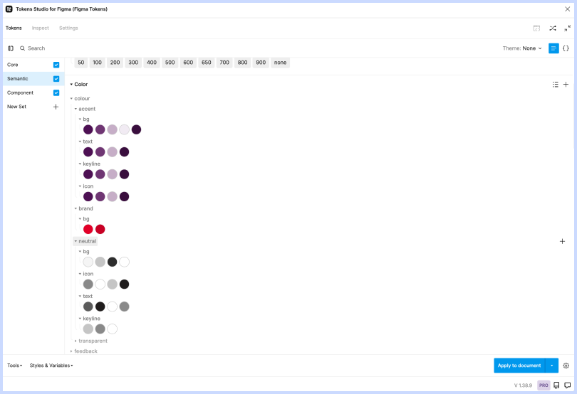
Token structure
After we did the desk research in the UX Research phase of the project, we were able to identify the best approach to the structure. We decided on a 3 tier structure; Core, Semantic, and Component. The reason we decided on this approach is because it would enable our internal development team, and our clients design and development team to rapidly repurpose the New World design system for Pak’n’Save and other brands in the future without over burdening the internal designers and developers.
The intention was that once we set the tokens and mapped them for the New World design system, the Foodstuffs design team would be able to copy the entire structure and only be required to update the Core tokens. This would create a whole new design system with the appropriate branding for any of the their 8 brands.
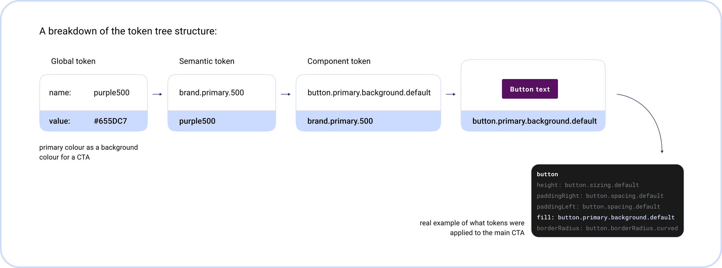
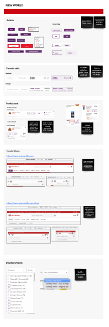
Snapshots of the tree structure used in Tokens Studio for Figma


Step 2
Component design
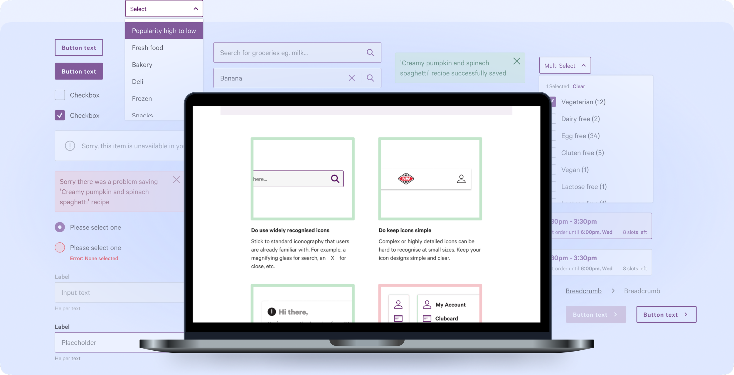
Unlike other design system projects I have done in the past, the unique aspect of this project was that the client did not want to change anything about their existing UI or brand. They weren’t interested in deviating from the existing website, instead, they wanted to translate their UI kit into the design system, using the tokens, and setting it up in Storybook. As mentioned earlier, this was all in anticipation of a large growth phase that the company was anticipating the following financial year. So the goal wasn’t a facelift, it was a tool to accelerate their team, making future design and development more streamlined and less resource-intensive.
When it came to the design side of the project, a lot of our time was spent on cataloging components, ensuring consistency, and maintaining high file hygiene, which are crucial for long-term maintenance and scalability. We were designing from scratch, rather than pulling in their designs so we had the most control over the accessibility, consistency, and craft as possible.
Because we had set up the tokens prior to starting the design of the components, we were able to create a component, with all of its variants and states, within an hour.
Definition of Done
To ensure continuous high-quality design at Foodstuffs, I developed a definition of done process for the designers. This process aims to boost their confidence in designing to all the criteria, particularly when introducing new components. Each addition to the design system requires approval from the Foodstuffs internal Design System Forum (DSF).
The DSF is a cross-disciplinary panel, comprising representatives from design, product, QA, and engineering teams at Foodstuffs. This group acts as the gatekeepers of the design system. Their role is to oversee its adherence to the governance standards established by RUSH, which sets them up to success in their principles of being able to evolve and do so efficiently.
{To clarify, this is not the governance piece of this project.}
-
Description given
Named correctly
Tokens mapped correctly
Peer reviewed
-
Layer named correctly
Styles added for colour, type etc (for Zeroheight integration)
Descriptions given
All variables are identified and createdAll states are identified and created
Both mobile and web designs done
Design conformance complete
Component set up for
Figma library usage
Peer reviewed
-
Accessibility guidelines for creation and implementation
Example in situ
Define variants and states
Write and create examples for do’s and don’ts
Write and create the component anatomy
Identify the token names applied to the components (for developers)
Peer reviewed
-
Variants and styles are documented
Code is documented
Usage is defined
Accessibility guidelines are defined
Governance for the component is prescribed; process for change, update, edit, or adding new elements or considerations
Glossary of terms if required
Design principles applied if applicable
Link to files if required
Peer reviewd
Governance +Documentation
Documentation was of high importance in this project, we wanted to be able to make it as easy as possible for their designers to pick up the design system, and run with it. We also wanted to make it so onboarding was simple and quick for the new designers being hired as part of the upcoming growth for the company.
Step 1
Design System Documentation Workshop
One of the first things we did was facilitate a Design System Documentation Workshop to discover what we believed was the most important information to have documented within the design system. We also wanted to discover what documentation the clients team valued independently, and what they valued collectively.
The outcome was that we (RUSH), were able to perceive the most valuable documentation, what was most valuable to each chapter, and would be able to evaluate where documentation should live within the documentation ecosystem for best use and access.
This would then set us up to be able to create an appropriate WoW and governance plan that included documentation authoring and maintenance.

Key outputs from the workshop
👉 Chapter documentation
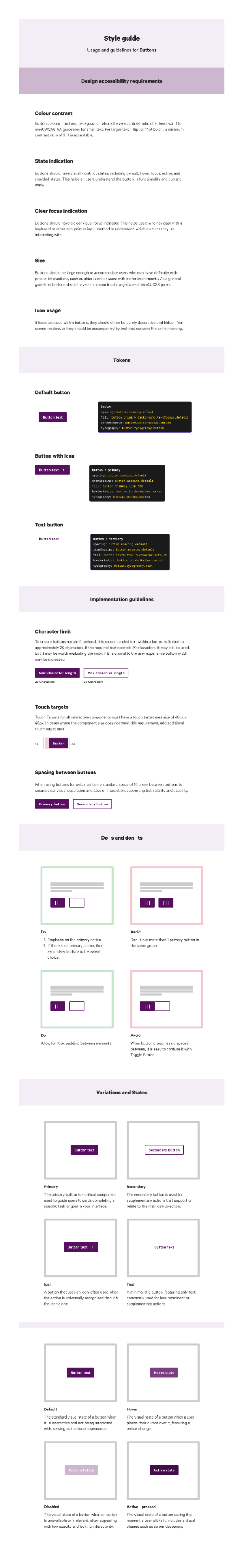
As I was writing the documentation for the design pillar of the project, I focused on the below as it came out as the highest priority for the clients designers:
Accessibility requirements
UX usage
Do’s and don’ts
Style guides
Mobile vs. Desktop
Token composition
Purpose of each component
Logic and behaviour
👉 Unifying documentation
In our workshop, we decided on a streamlined documentation approach by creating a central repository on Zeroheight. Zeroheight is awesome for its ability to integrate with Figma and Storybook, making it an ideal hub for consolidating documentation. It was great for the design system group through to marketing and other internal stakeholders. It landed on using it to house everything from style guides to change request forms and contribution guidelines, enhancing accessibility and collaboration across the organisation.
👉 Documentation ecosystem
We decided on three locations for the design system documentation; Figma, Storybook and Zeroheight.
Figma was used primarily for anything we deemed was needed by a designer whilst implementing, designing, or changing a component. (written by me)
Storybook was used for code documentation and a11y auto test results. (written by our FE)
Zeroheight was used for everything else. From style guides and a11y standards, through to contribution guidelines, processes, governance, and change logs. (written by me + PO)
Step 2
Writing the documentation
Once we had a list of things we wanted to document for their designers, it was easy to set up a template that was assigned to each component in the design system.
I have had experience previously in writing full documentation for a design system, so I already had a lot of resources at the my fingertips to speed up the process. In saying that, documentation took much longer to write than it did to design the component that it was for, and therefore I decided to create all the components upfront so that the developers weren’t blocked by me, and focused on the documentation once the design work was complete. This allowed me to progress through it much faster.
👉 Accessibility requirements
To achieve accurate a11y documentation, I used a11y websites such as W3C, and had regular meetings with our external accessibility consultant so ensure that everything being both designed and documented was as accessible as possible. The goal for this project was that the entire system achieved AA standard, and we did so. We used chromatic to ensure that not only the design was accessible, but so was the code.
👉 Tokens
I showed the tokens for most of the components in the documentation for two reasons.
I wanted the current designers (and future) to visually see the breakdown of the tokens assigned to the components. The goal of this was so they could use it as a reference when designing any additional components in the future, and knew which tokens needed to be assigned for it to be correctly mapped
It gave our internal and client developers a very quick and easy way to identify the tokens used for the components.
👉 Implementation
The implementation guidelines were pulled from different sources, but mainly a combination of the clients style guidelines, M3, and N/N for the best practices for UX usage and patterns.
👉 Do’s and don’ts
These were often common knowledge of UX patterns, but I often referenced M3 guidelines as Google are a great reference in general, but also fab for do’s and don’ts on more complex components.
👉 Variants
This was to showcase the uses and guidelines of when to use each variant, and was there to support onboarding of new designer and developers.
Next steps + Learnings
Learnings
As a UX designer, the Design System project for Foodstuffs has been a standout experience for me. The project not only appealed to my passion for process-driven tasks but also offered the opportunity to work with an incredibly engaged and enthusiastic client. Although we faced initial challenges in aligning the designers and developers with the project goals, our empathetic approach and willingness to listen played a crucial role in overcoming these hurdles. This experience highlighted the importance of valuing every stakeholder's perspective, from the top management to the end users of the design system.
The design system is now being used by Foodstuffs designers to build the live website, and by our internal designers at RUSH who are working on the innovation project.
Next steps
Once all of the components were designed, documentation written, and everything was built by the development team in Storybook, we handed everything over to the client. We did a handful of education sessions and workshops along the way, and at the end to make sure they were as empowered and confident as possible.